Growth Matters Brand Identity – Case Study
Building a Better Brand for a Growth-focused Trades Coach
The Problem
Businesses are often started by people who excel in a specific area, and this is particularly true in the trades.
However, a lot more goes into running an electrical, building or plumbing company than just doing a good job. There’s sales, marketing, operations, admin, finance and a host of other areas that a business owner must have a good handle on for their business to succeed.
That’s where Karl Martin, Trades Coach at GrowthMatters comes in. He is passionate about helping tradies grow their companies and achieve the financial freedom and flexibility they dreamed about when they first went into business.
We first met Karl when he was starting GrowthMatters – following over 20 years of experience in a wide range of industries and armed with a varied skill set, perfect for unlocking business growth.
Like many businesses starting from scratch, he’d developed his own logo as a placeholder until he got to the stage where he could professionally develop his brand.
Karl’s issue was his DIY logo didn’t speak to his market. The biggest problem was the choice of a thin font, which didn’t convey the strong, trustworthy nature of GrowthMatters.
This was especially important because, at the time, the trades coaching industry included operators who promised the earth and delivered little for their clients.
Karl needed a brand he was proud of and could stand behind.

Our Approach
Anthony Simons (Ants), Attain’s Director of Brand, made it his personal mission to help Karl redo his logo and develop a powerful brand identity.
As a process-driven person, Karl loved Ants’ design process. Tried, tested and robust, he knew it would achieve the outcome he wanted.
Crucially, instead of just someone scribbling some ideas on a piece of paper, there was a real purpose for each step.
This started with understanding what Karl was trying to develop with GrowthMatters and where he wanted to be positioned in the market – as a safe pair of hands and a long term partner for his clients.
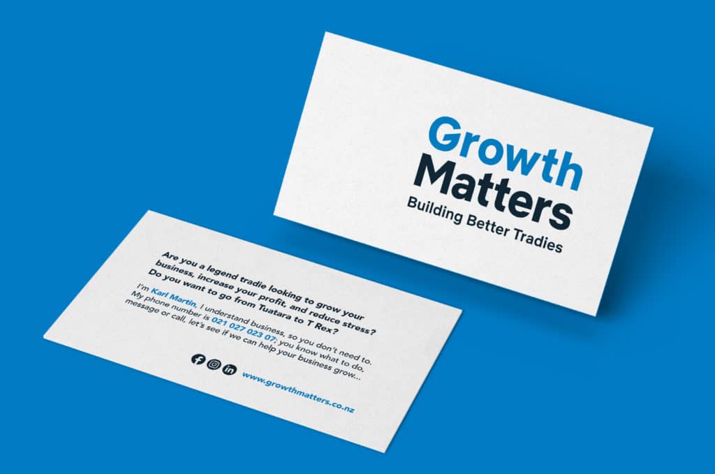
Additionally, Ants also wanted to do something a little different for Karl’s business cards.
The Solution
We delivered a brand new logo, which had the heft and grunt that Karl was looking for.
Ants also went further by developing a couple of taglines – “Building Better Tradies” and “Tuatara to T-Rex” – that resonate with Karl’s target market.
Instead of designing a standard business card, we wrote a short snippet of copy to engage whoever receives that card and encourage them to call Karl.
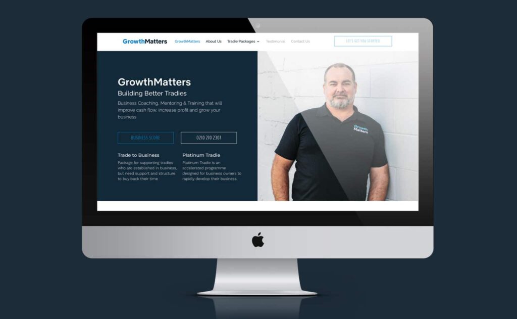
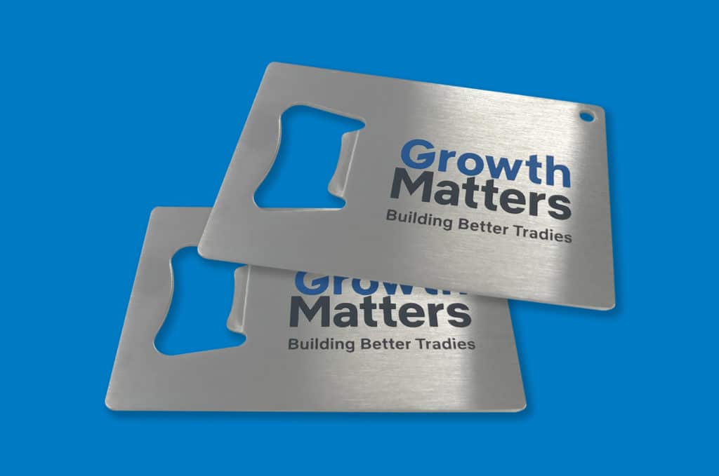
GrowthMatters’ new brand was rolled out on their new website, social media channels, business cards, the chilly bin (filled with beer!) Karl takes to building sites and the branded bottle openers he leaves behind.
Overview
Overall, Growth Matters’ new brand has had a massive impact.
For Karl, it was an “awesome outcome”, and his new logo is “legit”.
The new identity has completely changed the confidence Karl has in the look of his business – “I’m presenting something that represents me and adds to the overall customer experience.”
Karl really got the impact of the new brand when he was driving along with the new logo on his chest. He looked in the rear view mirror and was extremely proud of what he could see.
In addition to bringing weight to how Karl presents himself and his services, his new brand has longevity and is a key pillar that he can grow his business around.
Karl had “a great sense of pride in the end result” and, as this all happened during an incredibly turbulent period for the business, “it was really nice that Ants had [his] back through the process”.