iLENDER Brand Refresh Case Study
Taking a Successful Mortgage Broker to a Brand New Level
The Challenge
iLender is “probably the best mortgage broker in NZ”, with hundreds of positive customer reviews on TradeMe and Google.
Founded by Jeff Royle, his wife Heather joined the business five years ago after wanting a change from the corporate world. Coming on board, she engaged a graphic designer for a new logo, managed the web developers and wrote every word on the new website.
Fast forward five years, and Heather was thinking about a brand refresh. Jeff’s comment was – why change if things are going well? However, there was a need to modernise their look, and Heather knew that you can’t leave your brand as it is, even if it’s working.
The key problem was that they were trying to communicate too much in their logo, so it was extremely busy. They needed a really fresh new look. One that was clean, not cluttered, and would showcase how they care about people (symbolised by the “i” in their name).
She needed a designer to help take the iLender brand to the next level and stand out in a crowded market.
Our Approach
Heather was referred to Anthony (Ants) Simons, Attain’s Director of Brand and, unlike other designers that she’d spoken to, he listened to what she said.
“Ants quickly got a handle on what I wanted, understood what I was after, and had the confidence to jump in and provide feedback where necessary.”
Quite a contrast with other brand developers who didn’t get it – they said they knew exactly what she needed – but didn’t have all the information because Heather hadn’t told them what she wanted yet! Attain’s brand development process was easy to go through, documented and very clear.
“When going through the brand discovery process, we worked out that our point of difference was a great quality service for non-bank lending,” says Heather.
For some people, getting a mortgage from a bank is not an option. Fortunately, this doesn’t have to derail their dreams of owning a home, and iLender caters for the variety of reasons that a bank might say no. It is this approach of help, support, advice and being the ‘go to’ specialists that we wanted to communicate with iLender’s new brand.
The Solution
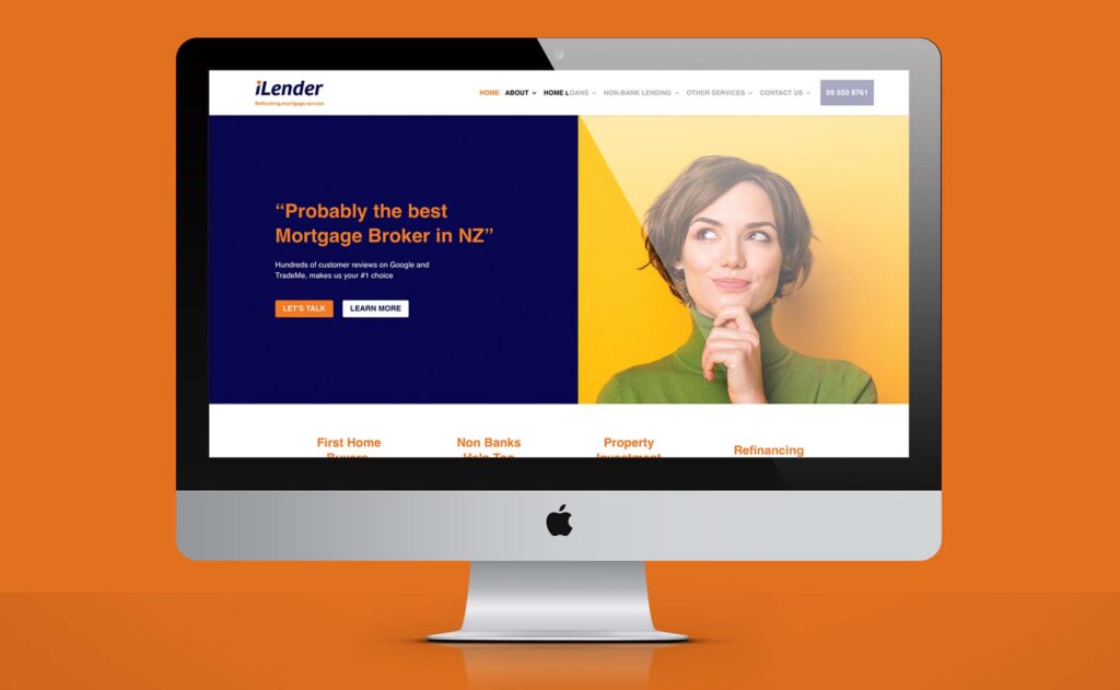
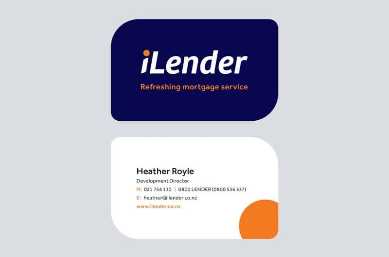
We did iLender’s whole brand identity – modernising their look and feel. This included updating slogans and coming up with a new tagline that was soft and consultative – “refreshing mortgage service”. In addition to a fresh, simple logo, this consistent look was rolled out over their website and social profiles.
For Heather, Ants had good communication and, importantly, “He’s not robotic, he’s human. He was just great and listened to what I wanted!”

Overview
“The proof is in the pudding,” says Heather.
iLender is growing month on month, and the feedback they’ve got from old customers, their team, and business contacts on their new brand have been fantastic. To prevent confusing old contacts when they came back to their website, an important part of the brief was that they didn’t want their new look to be vastly different from their old one. Attain’s solution has definitely delivered – treading that fine line while still modernising their website and overall look.
If you think your brand could do with a refresh, Heather’s advice is to “give Ants a call and check him out. He’s not stiff and starchy, not a stuffed suit.”